School of Management Color Palette
UB's primary colors, blue and white, date back to 1886, while our secondary pallette gives additional options to add vibrancy and convey tone.
The color examples below are rendered in web colors and not intended to match printed colors. Do not attempt to match these colors to your monitor or a printout. Consult a Pantone™ color swatch book for more accurate printed color representations.
Our Color Palette
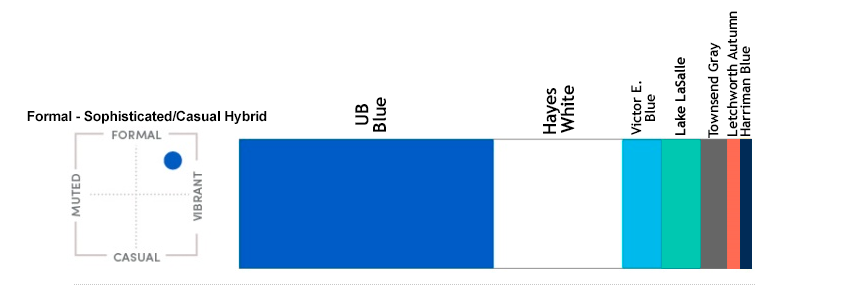
UB Blue and Hayes Hall White should anchor all communications pieces — creating a strong, immediate association with the School of Management and the University at Buffalo. Blue should make up 50% of the piece, and white should be 40%, with 5% remaining for Townsend Gray and 5% for other secondary colors.
In our color selection, we aim for a formal but vibrant feel and have chosen several colors from UB's secondary palette to match that tone. These should be used as pop colors and should not become a predominant color in any piece.
For the exact values of UB Blue and Hayes Hall White, see below. For the values of our secondary palette — Victor E. Blue, Lake LaSalle, Townsend Gray, Letchworth Autumn and Harriman Blue — visit the Color Palette page in the UB Brand Toolbox. There, you will also find a palette download for Adobe Creative Suite programs, best practices for using text with color, and more information on ratios of color.
UB Blue


Pantone
2935
C100
M53
Y0
K0
HEX: #005bbb
RGB: 0, 91, 187
Hayes Hall White


Pantone
White
C0
M0
Y0
K0
HEX: #ffffff
RGB: 255, 255, 255
Contact Us


School of Management
University at Buffalo
108 Jacobs Management Center
Buffalo, NY 14260-4000
Tel: 716-645-2833
Fax: 716-645-5926
mgt-pr@buffalo.edu
Building a brand and maintaining a consistent visual identity is a collaborative and complex process.
If you have questions, contact the Communications team at mgt-pr@buffalo.edu.